The other day I blogged about the exterior glass going up on the new Museum of Contemporary Art Denver building at 15th and Delgany in Downtown Denver’s Central Platte Valley district. Thanks to the good folks at MCAD and at London-based Adjaye/Associates, here’s the latest rendering showing the smoky-dark semi-translucent glass that will envelop the new building (click and expand to view the image at its full size):
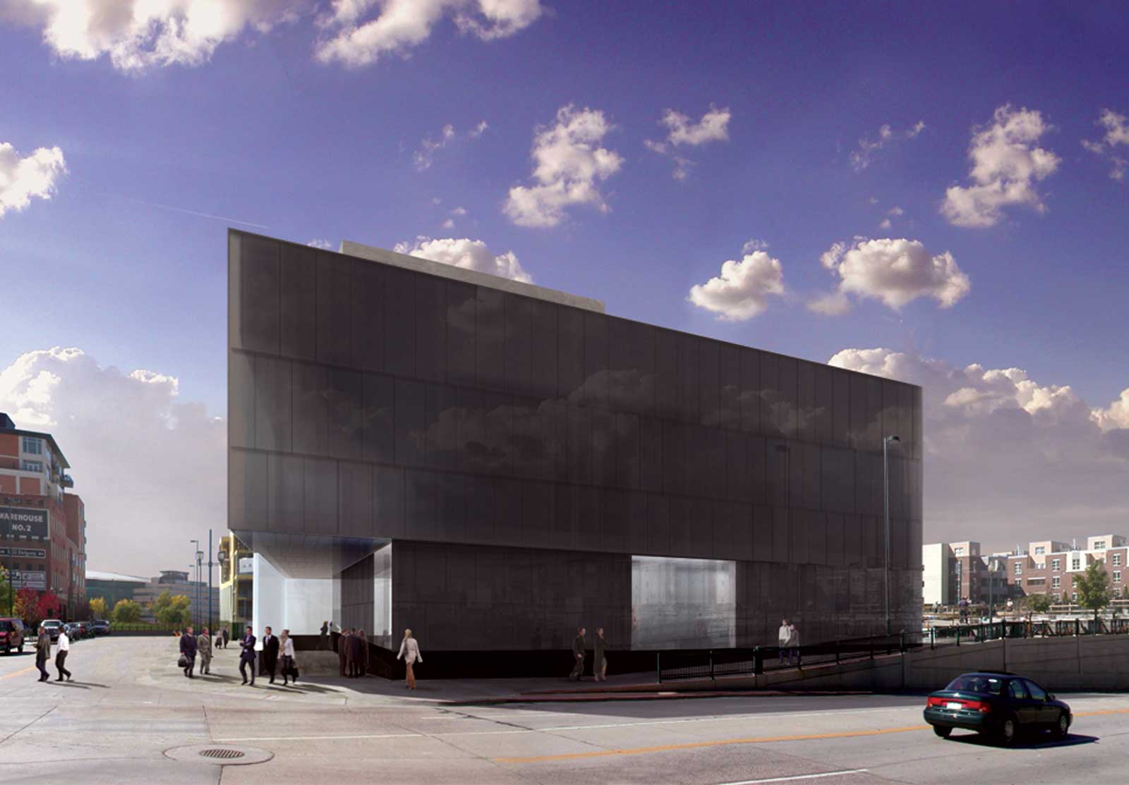
What a great location, at the cusp between LoDo and the CPV, for a cutting-edge cultural facility like the MCAD!