Wednesday, January 10, 2007
An Unfortunate Sign of the Times
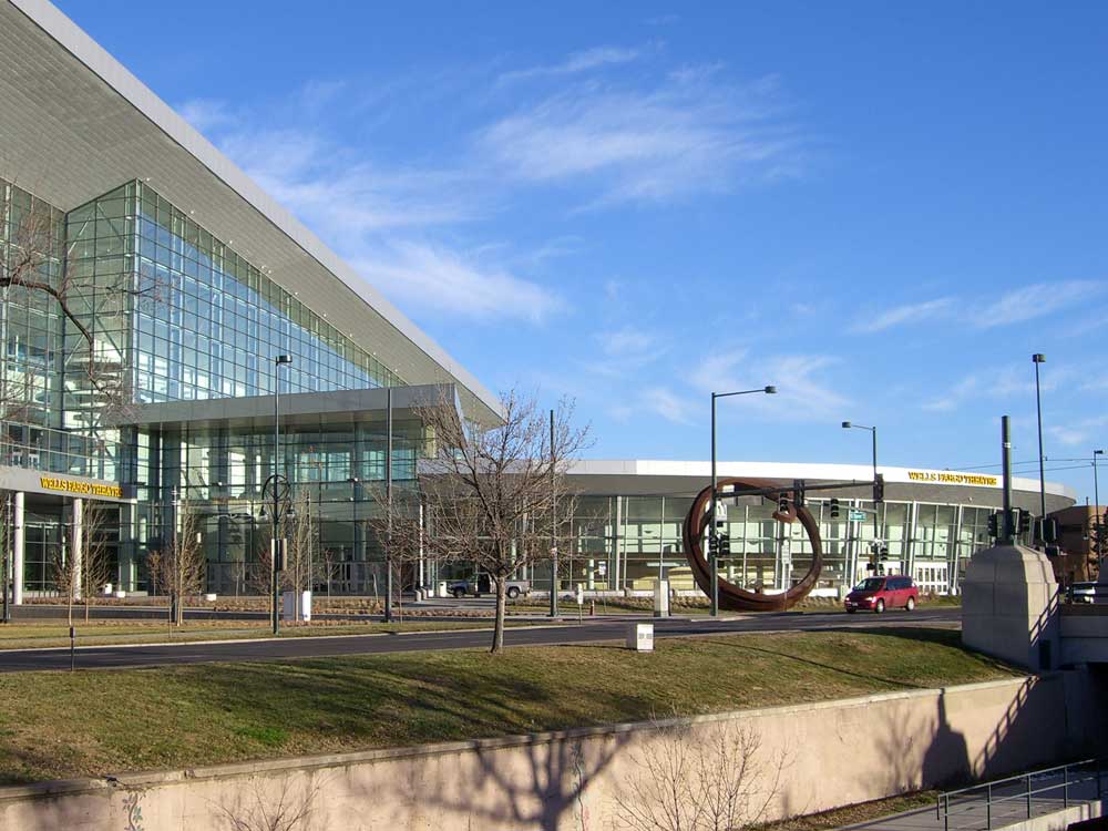
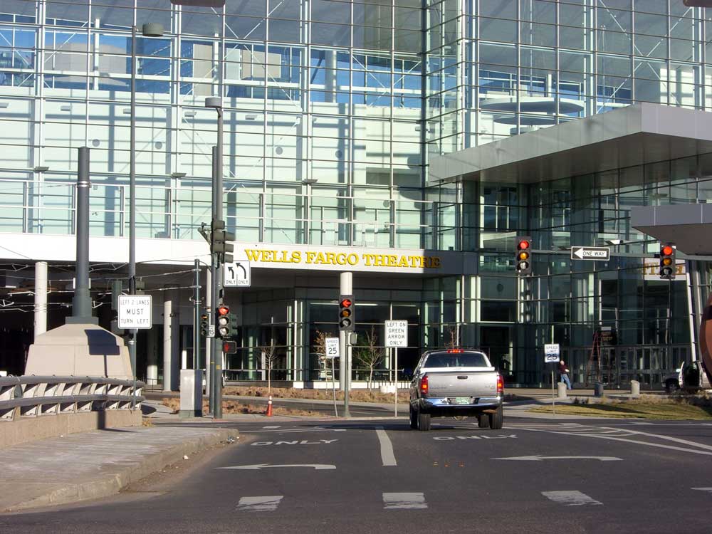
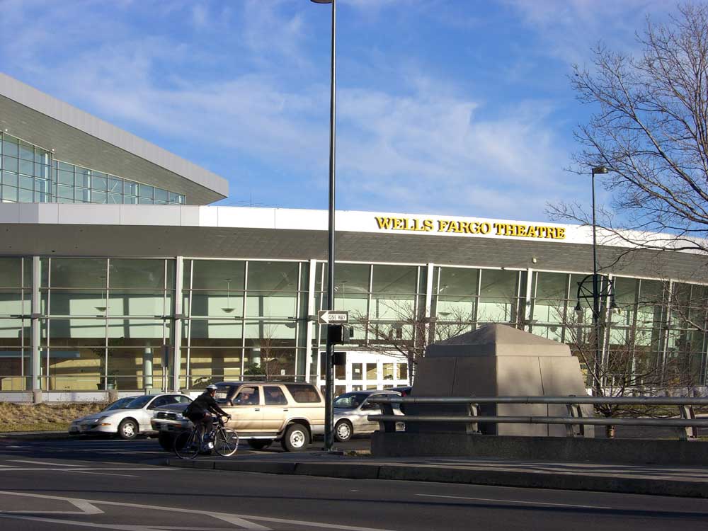
Last year, the City of Denver/Colorado Convention Center Hotel Authority sold the naming rights to the 5,000-seat theater (as well as other areas such as ballrooms, lobbies, etc.) inside the newly-expanded Colorado Convention Center. They sold the naming rights for the theater to Wells Fargo for several million dollars. Consequently, there are now two new signs proclaiming "Wells Fargo Theatre" on the west side of the convention center. Click on these to take a closer look:

I am not a fan of the selling of naming rights to civic facilities ("Invesco Field at Mile High" anyone?) but I suppose it's an unfortunate reality in this not-enough-budget-to-do-the-job-right era we live in. But if we're going to paste corporate names on the sides of our civic buildings, I hope that it can be done so tastefully.
In my opinion, the "Wells Fargo Theatre" signs are too large and detract from the sleek modern design of the convention center's exterior. The signs introduce a warm yellow color to an exterior composed entirely of cool monochromatic whites, silvers and grays. The sign clinging to the roofline of the curved theater lobby disrupts the effect of the lobby's gentle sweeping arc as a counterbalance to the sharp angularity of the soaring facade. I wonder if the architects at Fentress Bradburn who designed the convention center had any say in the size, color, and placement of these signs? If not, I wonder what they think of the impact of these signs on the appearance of the building they designed? I recognize that Wells Fargo deserves to receive name exposure commensurate with their multi-million dollar investment, but certainly these signs could have been more harmoniously integrated with the overall design aesthetic of the facility, while still providing the necessary visibility.
What's also interesting is that there is not one single sign on the Speer Boulevard side of the convention center that tells you that this massive building is the Colorado Convention Center. There is a prominent sign announcing the name of the facility on the 14th Street side, but none at all (that I could find anyway) on the Speer side. So, with not one but two conspicuous "Wells Fargo Theatre" signs and no "Colorado Convention Center" signs visible on the Speer side, a passerby on Speer Boulevard who didn't know any better could be easily led to believe that the entire 2.2 million SF facility is the Wells Fargo Theatre! I'm sure Wells Fargo wouldn't mind that.
Perhaps I'm just being overly sensitive, or perhaps we let a handsome public building be tarnished. What do you think?
Comments:
Links to this post:
<< Home
You are right that it is "undersignaged" on the speer side for the CCC. As for the corporate advertising i say 'big deal'...advertising has been going on for a hundred years and suddently everybody, especially in Denver, seems to think it's 'too much'.
Marketing is part of commerce and great cities that are full of people tend to have more advertising - it becomes part of the character (think about NYC with those great painted building walls...oh, that's not allowed by Denver's City council to "protect us"). I say take the revenue and put it to good use - our eyes can handle it.
As for the architects...well, it's simply not their building. They were paid a handsome fee for the project and should have zero input despite their good tase and sometimes delicate sensibilities.
The sign is utterly revolting. You're gonna have tourists driving through the tunnel under the convention center looking for the teller windows. Who let this happen? Does Peter Park's team have anything to say about the design and placement of signage?
I keep trying to make deposits here, but as of yet, there are no teller booths available... when these signs went up, I thought, jeezus are those HUGE... I agree with you Ken that the whole thing now looks to be the WELLS FARGO THEATER... I think we need to get some pellet guns and shoot these puppies down
I would love to see a sign on the front of the Guggenheim stating "wells fargo theater" or how about "Kenny Rogers Brosted Gallery".. all done in a tasty manner of course.
If you understand the way the building is used then you understand the signs make sense. You would be amazed at how many people need these signs to get around. Since that is the main entry point for the Theatre as far as concerts are concerned, it helps for it to pop out at people driving quickly by the Center (Also Wells Fargo was going to use one of their main colors). The 14th side is the main entry point for all public shows and conventions and the signs have been in study groups to see how they work.
If only you would have seen the first ideas for the sign, you would see there was a lot of efforts to keep it from destroying the look of the building.
I am sure a lot of people have better ideas, but would they have looked good and confused people looking for the Theatre to see a concert?
If only you would have seen the first ideas for the sign, you would see there was a lot of efforts to keep it from destroying the look of the building.
I am sure a lot of people have better ideas, but would they have looked good and confused people looking for the Theatre to see a concert?
For my part, I will treat this facility the same way I treat the football stadium, also named for a financial services corporation. This theater will always be, to me, "the theater at the Convention Center," just as the stadium is simply, and always, "Mile High Stadium." Selling naming rights for taxpayer-built facilities are just one more sad example of how our society priveleges corporations over individuals. It doesn't have to be this way.
In my humble opinion, what downtown Denver needs are MORE neon/flashing/gaudy signs on top or the sides of buildings (well, done tastefully, of course) so liven up our downtown. I'm not advocating a "Las Vegas" style downtown but a few more lights or signs help, you know? The "Qwest" sign on the Qwest building needs more company! I love looking at city skylines at night with all those lights. Just imagine Tokyo, or Hongkong etc. I think the "Wells Fargo" sign is appropriate.
Yeah, I'm with anon, Ken. I think you're being a tad picky on this one. I mean, they paid a ton for the building, so they've got the right to put their name however they want, IMHO. Besides, I live just North of tbe building and have been about it a few times and haven't noticed the sign until you pointed it out. So really, it's not that gaudy.
i noticed these signs yesterday morning and it wasn't the size or how they were incorporated into the architecture that bothered me. what bothered me is that wells fargo used their corporate colors and typeface for the signs and ended up branding the whole structure as a "wells fargo" building. if the signs used a different color or typeface than the branded wells fargo ones, it wouldn't bother me at all.
The convention center itself does desperately need better exterior signage, especially given most of its clientele is out-of-towners. If that problem was solved, it would reduce the visual emphasis on the wells fargo sign.
As it stands, this sign is pretty awful. At very least it should be better executed. From a visual design perpective, putting 'theatre' in the same typeface as wells fargo cheapens and weakens the brand identity. I'm actually really surprised Wells Fargo let them do that. I'd be willing to bet they have a "do not modify or add to the logo" area somewhere in their graphic standards manual. Plus it looks bad and is hard to read, so there's really no good rationale for doing it that way in the first place.
As an alternative, 'theatre' could have been set in Myriad (which is the secondary typeface of their brand) instead of Clarendon (or whatever that is) and call it done. It would match the building better, not bastardize the brand, identify the theatre more clearly, and look less awful.
Anyway, design-by-comittee strikes again....
Couldn't agree more on the signage. Naming rights I'm fine with, it's a part of modern business like it or not. But signage should complement a building's design not detract from it. Take for example Pepsi turning their logo into a giant sculpture in front of Pepsi Center, that's signage well done.
Not to mention I was driving on Speer the first time I noticed the sign and nearly got into a car accident!
Good point too about the lack of signage touting the Convention Center!
Not to mention I was driving on Speer the first time I noticed the sign and nearly got into a car accident!
Good point too about the lack of signage touting the Convention Center!
When Denver built the Convention Center, it got a huge, state of the art facility that attracts millions of visitors to the city. In selling the naming rights, it got back some of the money it spent in building such an enormous building - selling naming rights and accepting the presence of corporate names is what part of what allows public projects like the Convention Center to exist in the first place. IMHO, you win some, you lose some. Some of the asthetic value of the building may be compromised, but the impact is minor compared to the enormous and architecturally striking facility. The Wells Fargo sign is not a huge deal for me.
At least the company with its name on the Convention Center is a company with a major presence in Denver, filling many office buildings Downtown and outside Downtown, and Wells Fargo has historic ties to the West. It's not like when the Pepsi center was named by a company that has nothing to do with Denver at all and reeks of far-off corparatism, or like Invesco Field, which has one of the most boring and sterile sounding names possible.
I do, however think the lack of a "Colorado Convention Center" sign on the Speer side of the building is worth taking note of. Hopefully some sort of sign will be put in place sometime in the future. But that is going to depend on how much such a sign would cost.
I saw the sign above the tunnel when the lettering was white- I assume it was a protective film over the yellow. I must say it looked much, much better. And it seems that is what Ken is trying to say. Sure they paid millions for the naming rights, but that doesn't mean the sign has to be so tacky. That building has very nice lines with a monochromatic color scheme... and than POW! Yellow.
Post a Comment
Links to this post:
<< Home


